W1_SAUD_TUCKMAN ASSESMENT


  1. Problem Definition.

PMI program was initiated to develop project management competency on selected individuals from various industries in Oman. The program kicked off with a 5 days intensive face to face session. This resulted in forming OOCEP_PMI 2016 team consisting of 10 members with different backgrounds and experience levels in their associated industries. The main objective of this program is to build High performing team, acquire real and influential tools for creating the desired change in the work place which at end will lead to increase the overall productivity and save the cost significantly. Initially, it is very essential to put some effort to test and assess your team’s behavior and leadership style that the team is situated at and that will create a good understanding the way to improve the overall team works. This blog post explains the outcome of this task.


  1. Methodology:

Very essential to get a clear understanding on the team’s behavioral development situation, Dr. Bruce Tuchman Model typically known as the “Developmental Sequence in Small Groups” was used as a basis for this study. Therefore his survey was conducted between the team members to gather the views on where it stands as opposed to Tuchman’s model. Following is a further explanation on the analysis.


  1. Feasible Alternative.

Tuckman’s model (team work theory) explains that as the team develops maturity and ability, relationships establish, and the leader changes leadership style. Beginning with a directing style, moving through coaching, then participating, finishing delegating and almost detached.

Stages-of-Group-Formation-1024x557

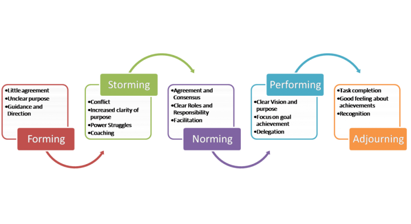
Tuckman Stages of group development

  1. Development of the Outcome for Alternative

As illustrated in the above diagram. There are various stages that the team goes through in terms of the level of collaboration and hence the required leadership style. Below is a brief description of each stage:

  • Forming stage: The forming stage represents a time where the group is just starting to come together and is characterized with anxiety and uncertainty.
  • Storming stage. The storming stage is where conflict and competition are at its greatest
  • Norming stage. The norming stage is the time where the group becomes a cohesive unit
  • Performing stage. The performing stage is marked by high productivity

In order to illustrate the OOCE 2016 team’s current position on this model a survey of 32 questions between the active members of the team was conducted. A collection of 23 responses from the team illustrated the various interpretations of the team members and the current team development stage.


  1. Selection of Criteria.

Delphi technique with P85 was used to analyze the outcomes of the survey critically. This method was used to provide an approximate 85% chance of illustrating the stage that the teams fall in. The following table illustrates the results


Average 25 21 29 32
Maximum 28 26 32 37
Minimum 22 17 25 28
         
Mean 25.0 21.0 28.8 32.2
         
Standard deviation 6 9 7 9
Sigma 1.00 1.50 1.17 1.50
Standard variance 1.00 2.25 1.36 2.25
         
P85 31 30 36 42
* Find the z-score
z =(  value − mean ) / standard deviation


  1. Analysis and Comparation of the Alternative.

Clearly the above results is give a good indication that OOCEP_PMI 2016 team is most likely stay strongly in in the Performing Stage.


  1. Selection of the Preferred Alternative.

Getting this result will tell the team that they are in the stage that they are work collaboratively, care about their success as a group, their identity is become very clear and they are interdependent.


  1. Performance Monitoring and the Post Evaluation of Result.

In order to ensure that that individual member is performing in line with the established plan. Periodic meetings will be essential in order to assess the individual and overall team performance. Both Leaders and members must work together closely to achieve the projects objectives.


  1. References:
  • The Delphi Technique: Making Sense Of Consensus , Chia-Chien Hsu, The Ohio State University & Brian A. Sandford, Oklahoma State University, Retrieved August 21, 2016, from  http://pareonline.net/pdf/v12n10.pdf


  • Chapter 6: The Normal Distribution Dr. Janet Winter, jmw11@psu.edu, Retrieved August 21, 2016, from

http://bk.psu.edu/clt/Stat200/Chapter6_Printable.pdf


W3_Abdullah Al Ansari _ Create Gantt chart.

POSTED ON Monday, 22 Aug 2016, 14:00 BY Abdullah Al Ansari

  1. Problem Definition

Part of frac operation progress updates is to reflect the status of each unit performance and how much work is done so that the other unit will take over till frac operation completed. For that The Gantt Charts is a project planning tool that is used to represent the timing of tasks required to complete a project. Because Gantt Charts are simple to understand and easy to construct, they are used by many project managers for all but the most complex projects.

  1. 2. Identify the Feasible Alternative

Gantt chart is a popular project management bar chart that tracks tasks across time. Since their first introduction, Gantt charts have become an industry standard.

gantt Chart

Figure.1: Gantt chart


  1. 3. Development of the Outcome for Alternative

To implement Gantt chart, I listed all the activities assigned to frac operation. The activities are (Slickline unit, Coil tubing unit, wireline unit, frac unit, Sand Management system unit).

Frac Sequence Gantt Chart

Figure.2: The Frac Sequence List.


After this, I followed the procedures to generate the Gantt chart using Excel Sheet.

  1. Selection of Criteria

On the top menu, select Insert, and then click on the Bar chart icon. When the drop-down menu appears, choose the flat Stacked Bar Chart. This will insert a blank chart onto your spreadsheet.

Add Start Date data.

  1. Position your mouse over the empty Excel chart and right click. Then, left click on Select Data. The Select Data Source window will appear.
  2. Under Legend Entries (Series), click Add. This will take you to the Edit Series window.
  3. Click in the empty Series name: form field first, and then click on the table cell that reads Start Date.
  4. Click on the icon at the end of the Series values field. The icon is a small spreadsheet with a red arrow (the lower icon). This will open the Edit Series window. Click on the first Start Date, 22/8 in my example, and drag your mouse down to the last Start Date. After the right dates are highlighted, click on the icon at the end of the Edit Series form. The window will close and the previous window will reopen. Select OK. Your start dates are now in the Gantt chart.
  5. Next, add the Durations column using the same procedure you used to add the start dates.
  1. Notice your tasks are in reverse order. To fix this, click on the list of tasks to select them, then right click over the list and choose Format Axis. Select the checkbox Categories in reverse order and Close.To give your Gantt chart more space delete the Start Date, Duration legend on the right. Select it with your mouse, then hit delete.
  2. Hide the blue portions of each bar. Clicking on the blue part of any bar will select all of them. Then, right click and choose Format Data Series.
  3. Click on Fill then select No fill.
  4. Click on Border Color then select No line.
  5. You just need to remove the empty white space at the start of your Gantt chart:
  6. Click on the first Start Date in your data table. Right click over it, select Format Cells, then General. Write down the number you see. In my case it is 42604 Hit Cancel because you do not want to actually make or any change here.
  7. In the Gantt chart, select the dates above the bars right click and choose Format Axis.
  8. Change Minimum to Fixed and enter the number you recorded.
  9. Change Major unit to Fixed and enter 2, for every other day. You can play with this to see what works best for you.
  10. Select Close.

Gantt Chart_final

Figure.3: The Gantt Chart in Excel Sheet

  1. Analysis of the Alternative.

Advantages of Gantt Charts:

  • It creates a picture of complexity
  • It organizes your thoughts.
  • It demonstrates that you know what you’re doing.
  • It (should) help you to set realistic time frames.
  • It can be highly visible.
  1. Selection of the Preferred Alternative.

In summary, Gantt chart is an important project management tool used for showing the phases, tasks, milestones and resources needed as part of a project.

  1. 7. Performance Monitoring and the Post Evaluation of Result.

As we have a weekly team meeting to discuss the work progress and highlight the issues during last week. We can monitor the Gantt chart and update it in the team performance review session.


  1. References
  1. Jodi Sorensen (2013, July). How to Create a Gantt Chart in Excel Retrieved Aug 03, 2016, from http://www.smartsheet.com/blog/gantt-chart-excel?page=27
  2. Chart Director (2008, December). Simple Gantt Chart. Retrieved Aug 03, 2016, from http://www.qrb-bw.de/pdf_pool/pythondemo/cdpydoc/gantt.htm
  1.  (2013, August). How to Create a Gantt Chart Using Microsoft Excel. Retrieved Aug 03, 2016, from http://www.projectsmart.co.uk/creating-a-gantt-chart-using-excel.php